Sun Belle grows and distributes premium berries across the Americas, but its website hadn't kept pace with the brand. Ten navigation items competed at the same level, pages used inconsistent colors and layouts, the homepage led with recipes instead of the product, and the fixed-width layout broke down on mobile.
I joined as the freelance product designer on a brand refresh led by a marketing agency, working with the client and a small development team. My role was to turn the new identity into a site with a clear structure, product-first presentation, and a responsive experience that finally matched Sun Belle's premium positioning.
Freelance Designer
Web design
Visual Design
Responsive Design
My goal was to turn a site that had fallen years behind the brand into one that matched Sun Belle's premium positioning. The legacy site buried the product under recipes and scattered navigation, looked different from page to page, and broke down on mobile. With no real baseline to work from, I grounded decisions in usability heuristics and close collaboration with the client, the agency leading the brand refresh, and the development team.
I began by evaluating every page of the legacy site against established usability heuristics. The findings were consistent: navigation items competing at one level, organic berries separated from the rest of the product line, inconsistent colors and layouts across berry pages, stale content, and a fixed-width layout that shrank rather than adapted on mobile.
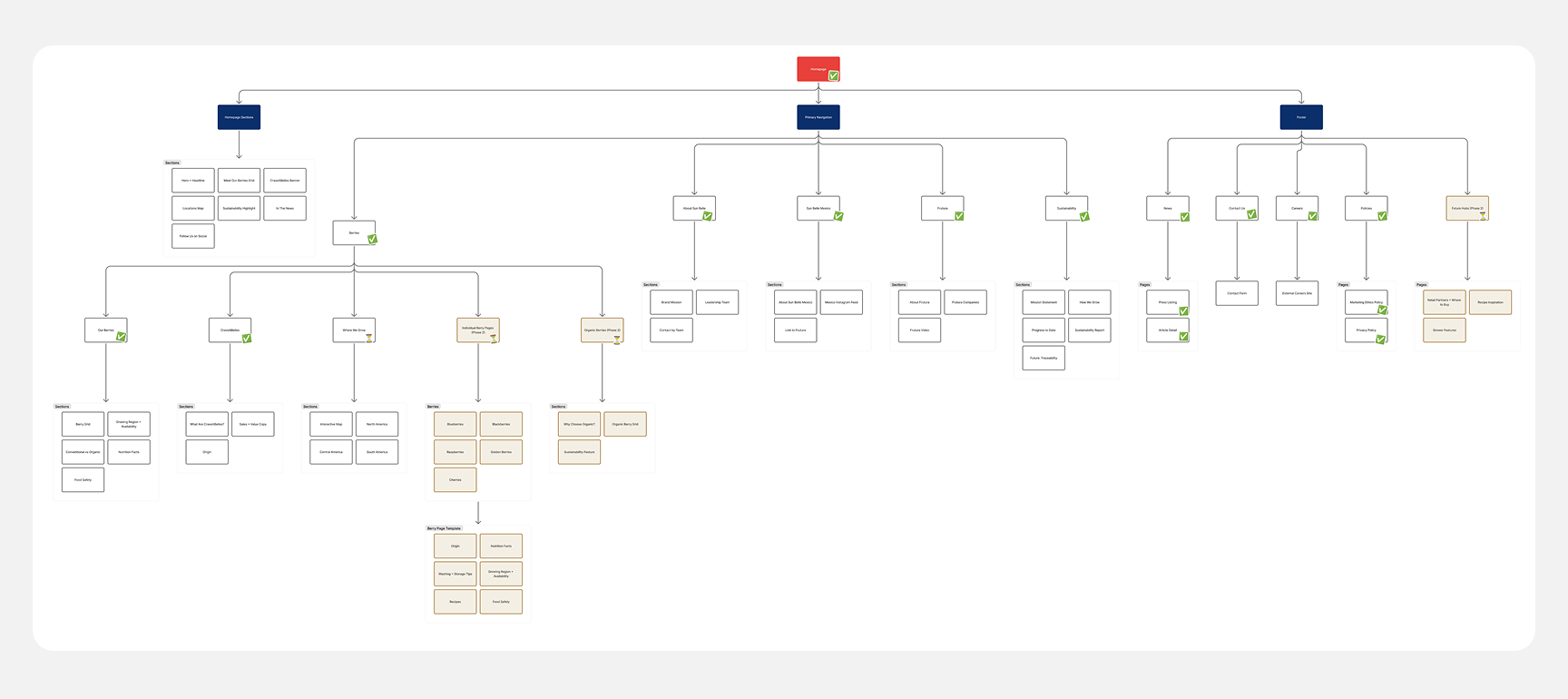
We consolidated the sitemap into clear sections: Berries, About, and Sustainability. Organic and conventional berries came together under one product area.
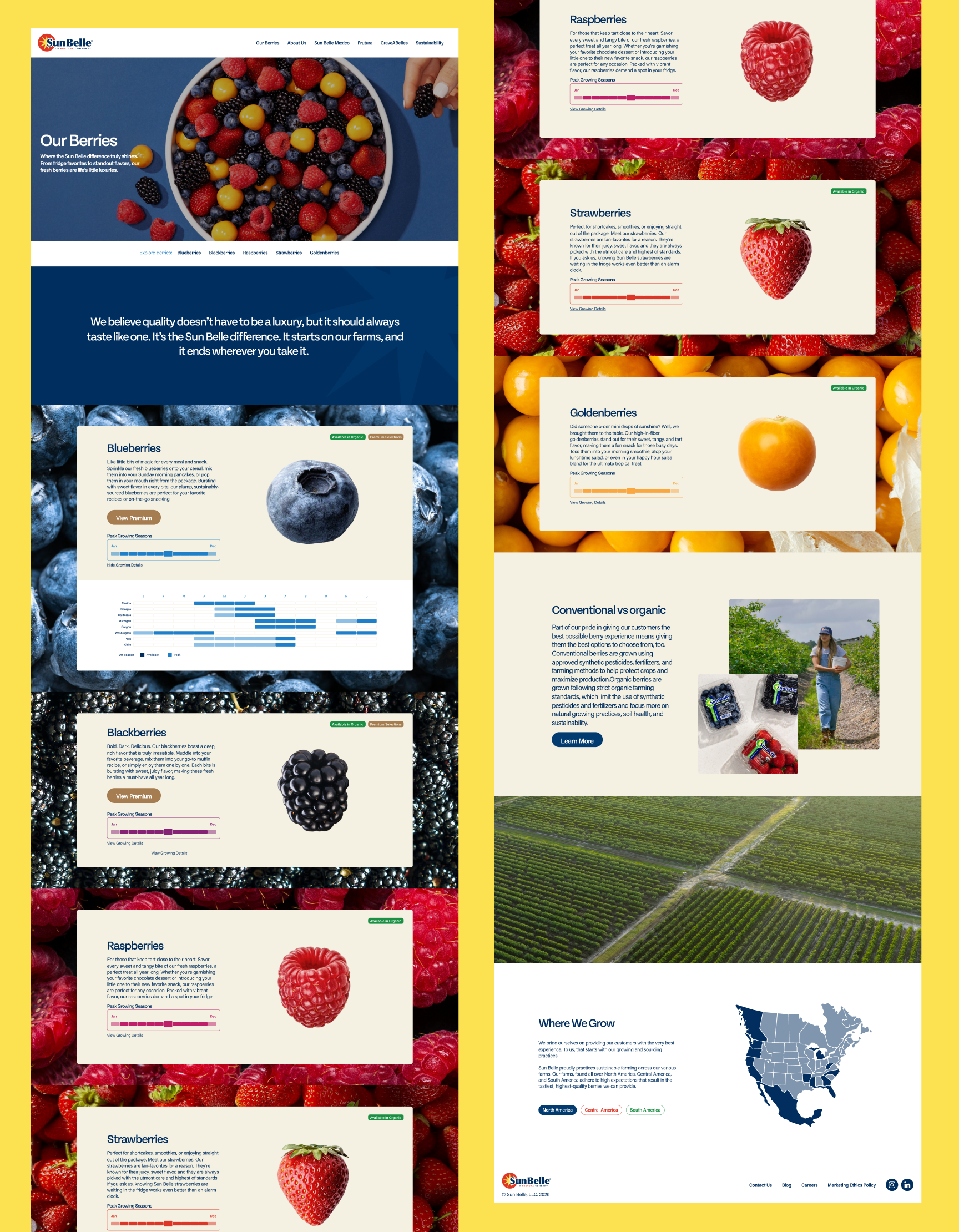
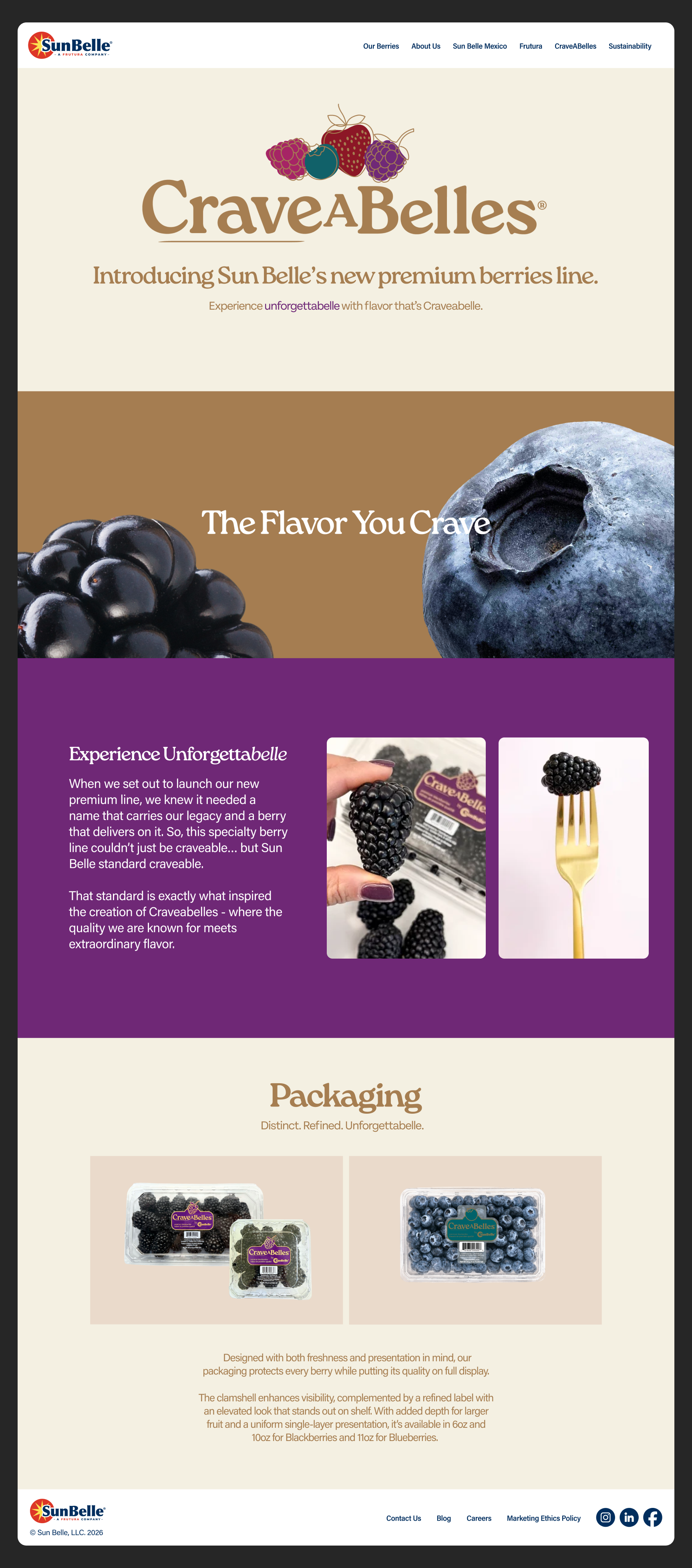
I rebuilt the page hierarchy so the berries lead every key page. Large, image-led product sections replaced text-heavy pages, origin and sourcing became interactive maps, and I translated the agency's new identity into consistent layouts, type, and components the development team could build across the site on any screen size.
I ran structured feedback rounds with the client and agency so decisions were made together rather than revealed at the end. Before launch, we tested the site with users to confirm visitors could find products and navigate the new structure, catching issues early.
The legacy site had grown one page at a time, leaving ten navigation items competing at the same level and the same products split across multiple sections. We worked with the client to map every piece of content by page, then reorganized it into five clear sections built around how visitors actually look for things: the product first, then the company, its operations, and its values. We split the build into two phases so the site could launch alongside the brand refresh, while the structure was designed from the start to absorb future pages like individual berry profiles, organic offerings, retail partners, and recipes without another reorganization.
The redesigned site leads with the product. Berries take center stage on every key page, navigation is organized around how visitors actually browse, and a consistent responsive system carries the new brand from desktop to mobile.